

How Long Does a Story Stay "Most Read"? A Q3 2026 Look Across 16 News Sites
By Rene Roost | Published: October 5, 2026
This is the second quarterly overview from Most Read News. The first one compared nine news sites. This one compares sixteen: every list I recorded for the whole quarter, from the first day of July to the last day of September.
Every figure here comes from one kind of evidence. News sites publish a list of the stories their own readers click most, and I record those lists around the clock. The sixteen sites here head theirs "Most Popular", "Most Read", "Most Viewed", "Trending", "Trending Now", "Most Popular News" or "Popular Articles"; for short, I call them all Most Read lists. The full procedure is on the methodology page.
Key findings
- Lists differ enormously in how long they keep a story, and the differences follow a pattern. A typical story lasts 3 hours on CNBC's list and 23 hours on The Verge's, though both lists show five stories. Lists that are slow to admit a story are slow to let it go: CNBC shows a new story about an hour after it's published and keeps it about three, while The Wall Street Journal takes about 14 hours to show one and keeps it about 18. Across all sixteen lists the two clocks line up closely, which is new evidence for the explanation I could only suggest last quarter: that lists differ mainly in how far back they look when they count clicks.
- Each list keeps its own tempo. The eight lists I tracked in both quarters had a median stay of 6 hours in Q2 and 6 hours in Q3. The BBC's median was 6 hours in every month from January to September, and CNBC's 3 hours in every month from March.
- Weekends slow the lists down. The lists take in about a quarter fewer new stories on Saturdays and Sundays, and a story that arrives at the weekend stays about a quarter longer than one that arrives on a weekday. On CNBC's list the typical stay more than doubles, from 3 hours to 7. A list has a fixed number of places, so fewer newcomers means more time for each.
- How long a story stays depends more on its list than on its subject. A political story on CNBC's list and one on The Verge's live very different lives. Measured against each list's own norm, most subjects run long on some lists and short on others; of the most widely carried, only US politics and medical and health run long on at least three lists in four.
- A record, by a wide margin. A New Scientist story on gifted children stayed on its list for 400 hours, nearly 17 days, twice last quarter's record. Long runs are rare even there: 14 of New Scientist's 545 stories stayed more than a week, against two on all the other lists combined. They are a property of that list, not proof that science wins attention.
What I measure, and how to read the numbers
A Most Read list is a short list, usually ranked, that a news site shows on its own pages: typically the five or ten stories its readers are clicking most. Each site builds its list its own way, from its own traffic, and few publish how. What I can see from outside is the list itself: which stories are on it, in what order, at each reading.
The main measurement in this report is simple: for how many hours was a story anywhere on its site's list? I call that the story's stay. A story that enters the BBC's list at 9:00 and drops off at 15:00 has a stay of six hours, whether it spent those hours at #1 or at #10. If it leaves and later returns, both stretches count.
Stays vary hugely from story to story, so I summarise each list with two numbers rather than an average, which a handful of long-running stories would pull upward:
- The median is the middle story: on a list with a 6-hour median, half of all stories are gone within 6 hours. It answers "what happens to a typical story here?"
- The 90th percentile is where the longest-lasting tenth begin: on a list with an 18-hour 90th percentile, nine stories in ten are gone within 18 hours. It answers "how long does a story last when it catches on?"
I also give the share of stories that stayed at least a full day, because it's the easiest of the three to picture.
One more distinction runs through every table. My recording occasionally misses a reading. When a story was on the list both before and after a short gap, I fill the gap by interpolation and mark it as reconstructed. Direct figures count only readings I actually took; +reconstructed figures also count the filled gaps. Direct figures slightly understate time on the list, and reconstructed ones may slightly overstate it. For most lists the two agree; the two that don't are explained under Data completeness.
The full picture: sixteen lists compared
Sources are ordered by the median on the direct count, longest-lived at the top. List size is the number of stories each site shows on its own list.
| Source | List size | Median stay (hours)[1] | Median, +reconstructed[2] | 90th percentile (hours)[3] | Stayed a day or more |
|---|---|---|---|---|---|
| TechCrunch ◆ | 7, no order | 93 | 94 | 143 | 81% |
| The Verge | 5 | 23 | 23 | 45 | 50% |
| Ars Technica | 5 | 21 | 22 | 53 | 44% |
| The New York Times ◆ | 20, no order | 21 | 24 | 43 | 43% |
| New Scientist | 10 | 19 | 19 | 93 | 46% |
| Politico (US) | 5 | 19 | 20 | 35 | 36% |
| Deutsche Welle | 5 | 18 | 18 | 42 | 34% |
| The Wall Street Journal | 5 | 18 | 19 | 29 | 26% |
| Financial Times | 5 | 16 | 16 | 25 | 18% |
| Business Insider | 10 | 9 | 9 | 43 | 24% |
| The Guardian (World) | 10 | 8 | 11 | 20 | 6% |
| Forbes | 10 | 6 | 6 | 31 | 15% |
| BBC | 10 | 6 | 6 | 18 | 4% |
| Al Jazeera | 10 | 6 | 6 | 17 | 4% |
| The Hill † | 10+ | 5 | 5 | 22 | 8% |
| CNBC | 5 | 3 | 3 | 15 | 4% |
| All 16, pooled | — | 8 | 9 | 31 | 17% |
◆ These two lists have no popularity order. The New York Times publishes its twenty most-viewed stories of the past day, and TechCrunch a set of its popular stories, but neither ranks them. Their figures are hours on the list, like every other row, but nothing in this report or on this site ranks their stories by position, and they're left out of the #1 records. Both lists span a day or more, so compare each with itself over time, not with the BBC's 6 hours. How I handle them is on the methodology page.
† The Hill's list runs past ten stories. As with every ranked list longer than ten, I record its top ten, so its figures are hours in the top ten.
The lists fall into three rough groups, and it's worth reading the table that way rather than row by row.
The fast lists: CNBC, The Hill, Al Jazeera, the BBC and Forbes. A typical story lasts three to six hours, and on four of them fewer than one story in ten lasts a day (Forbes has a longer tail, with 15%). CNBC is the extreme: a typical story is gone in three hours, so someone who checks its list at breakfast and again at dinner sees an almost entirely new list. These lists show what readers are clicking right now.
The slow lists: The Verge, Ars Technica, Politico, Deutsche Welle, The Wall Street Journal, the Financial Times and New Scientist. A typical story lasts sixteen to twenty-three hours, and on most of them a third or more of stories last a full day. A reader who checks The Verge at the same time each day will, four times in five, find at least one of the previous day's stories still on the list. These lists show what readers picked over the past day rather than the past hour.
In between: Business Insider and The Guardian (World). Their typical story lasts eight or nine hours. Business Insider sits in the middle for a reason I come back to below: its list became faster during the year.
TechCrunch and The New York Times stand apart, for the reasons in the ◆ note under the table.
The pooled figure, 8 hours, depends on which lists are in the mix, and the mix changed a lot since Q2, so it isn't comparable with Q2's. The like-for-like comparison is in Same lists, same tempo.
Last quarter I tested whether list size explains any of this, and it still doesn't. The five-story lists run from CNBC's 3 hours to The Verge's 23. The ten-story lists run from 6 hours on the BBC and Forbes to New Scientist's 19. A short list can be the fastest in the catalogue or among the slowest.
Two clocks
If list size doesn't explain why CNBC's list moves nearly eight times faster than The Verge's, what does? This quarter I measured something the Q2 report didn't: how long each list takes to pick up a new story in the first place.
For every story, I compare two times: when it was published, and when it first appeared on its site's list. The difference is the story's time to list. A breaking story on a fast list can appear within the hour. On a slow list, the same kind of story might take half a day.
Here are the two clocks side by side for each list: the typical time to list, the share of stories that appeared within three hours of publication, and the typical stay from the main table.[4]
| Source | Typical time to list | Listed within 3 hours | Typical stay |
|---|---|---|---|
| CNBC | about 1 hour | 88% | 3 hours |
| The Hill | about 1 hour | 86% | 5 hours |
| Al Jazeera | 1.5 hours | 91% | 6 hours |
| Forbes | 1.5 hours | 65% | 6 hours |
| BBC | 2 hours | 68% | 6 hours |
| The Guardian (World) | 2 hours | 80% | 8 hours |
| New Scientist | 4 hours | 48% | 19 hours |
| Business Insider | 5 hours | 9% | 9 hours |
| The New York Times | 5 hours | 34% | 21 hours |
| Financial Times | 7 hours | 18% | 16 hours |
| The Verge | 9.5 hours | 8% | 23 hours |
| Ars Technica | 12.5 hours | 3% | 21 hours |
| Politico (US) | 13 hours | 0% | 19 hours |
| The Wall Street Journal | 14 hours | 1% | 18 hours |
| Deutsche Welle | 15 hours | 0% | 18 hours |
| TechCrunch | 32.5 hours | 2% | 93 hours |
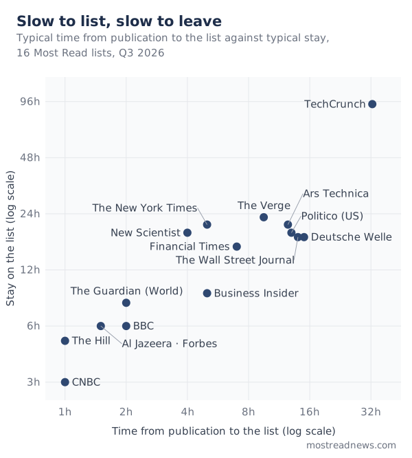
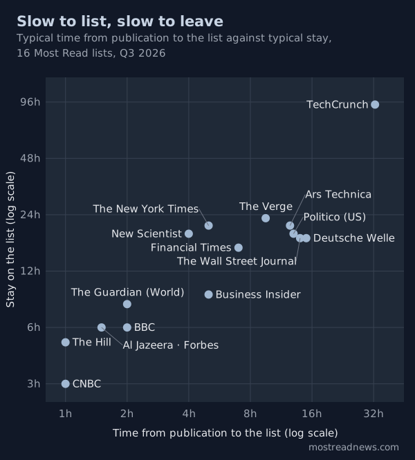
Read down the two outer columns and they rise together. The lists that pick up a story within an hour or two keep it for three to eight hours. The lists that take half a day to pick it up keep it for most of a day. TechCrunch, the slowest to pick up a story, is also the slowest to let one go.
To put a number on how closely the two clocks agree, I ranked the sixteen lists twice: once by time to list, once by typical stay. If the two rankings were identical, their correlation would be 1; if they were unrelated, it would be around 0. It comes out at 0.82. That's a strong relationship for sixteen independent publishers, and it doesn't depend on the two unusual lists: without TechCrunch it's 0.78, and without both TechCrunch and The New York Times, 0.83.
Why would the two clocks move together? Publishers don't say how they build their lists, so this is inference, not disclosure. But one mechanism produces exactly this pattern. A Most Read list counts clicks over some period before it ranks anything: the past hour, the past few hours, the past day. Call that its lookback window. A short window responds quickly in both directions. A long one makes a new story wait hours before it can compete, then keeps it on the list long after its clicks have slowed.
In Q2 I suggested that different windows might explain the gap between fast and slow lists, but I could only say the stays were consistent with it. Time to list is an independent measurement, taken at the other end of a story's life, and it points the same way. It doesn't prove the mechanism, since I still can't see inside any publisher's system, but a hypothesis that predicts two separate measurements is much stronger than one that fits a single measurement.
Three lists are worth a closer look, because each shows where the simple picture needs care:
- The New York Times describes its list as the most-viewed stories of the past day, so a story enters once it has a few hours of views and stays about a day: a lookback window stated in plain terms.
- New Scientist picks up stories in about 4 hours, yet its 90th percentile is 93 hours, the second longest in the table. The reason is its back catalogue: 16.7% of the time on its list was held by stories more than a week old, against 5% for the next list, Business Insider, and under 1% for most. New Scientist's list gives much of its time to older pieces, which stretches its long tail without slowing its intake.
- TechCrunch usually lists a story more than a day after it's published: 59% of its stories appeared on its list more than 24 hours after publication. Its list appears to count over a long period.
What this means for a reader is practical. The fast lists tell you what people are clicking now. The slow lists tell you what people clicked over the past day, and by the time a story appears there it has often been out for half a day. Neither is better. They answer different questions.
Same lists, same tempo
With eight lists now tracked for two full quarters, I can ask whether a list's tempo is stable, or whether the Q2 figures were a one-off.
Each cell below is the median stay and the 90th percentile, in hours, on the direct count. The Q2 figures are recomputed on today's record, so they include the corrections noted at the foot of the Q2 report.[5]
| Source | Q2 2026 | Q3 2026 |
|---|---|---|
| The Verge | 22 / 45 | 23 / 45 |
| Ars Technica | 16 / 38 | 21 / 53 |
| Business Insider | 16 / 57 | 9 / 43 |
| The Guardian (World) | 8 / 17 | 8 / 20 |
| Al Jazeera | 6 / 19 | 6 / 17 |
| BBC | 6 / 17 | 6 / 18 |
| Forbes | 5 / 32 | 6 / 31 |
| CNBC | 3 / 15 | 3 / 15 |
| These eight, pooled | 6 / 24 | 6 / 25 |
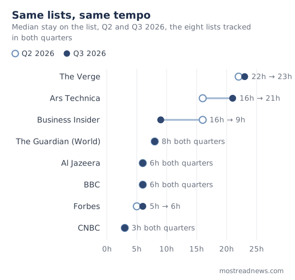
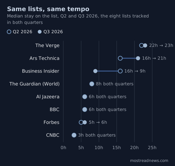
Six of the eight lists moved by an hour or less at the median. Taken together, the eight lists have the same median in both quarters, and a 90th percentile only an hour longer in Q3.
Month by month, the stability is even clearer. Grouping stories by the month they were published, the BBC's median was 6 hours in every month from January to September, nine months in a row. CNBC's was 3 hours in every month from March. The Verge's stayed between 20 and 24 hours in every month. Al Jazeera's ranged from 5 to 7 hours, and the Guardian's World list from 6 to 9.
That consistency matters beyond these eight lists. News itself was anything but steady over those nine months: wars, major breaking stories, and new contenders for every list's few places around the clock. Yet each list's median barely moved. The tempo of a list is set mostly by how the list is built, not by the news that fills it.
Ars Technica's move from 16 to 21 hours is mostly a measurement effect: less of its Q2 record was recorded directly, and on the reconstructed count, which fills short gaps, it barely changed, from 23 hours to 22.
The one real change is Business Insider. Its median fell from 16 hours to 9. Month by month, it held at 16 to 18 hours from January to May, fell to 13 in June, and has been 8 to 10 hours since July. Its list still shows ten stories, and nothing changed in how I record it. What changed is how many new stories pass through the list. In Q2's thirteen weeks, an average of 67 new stories appeared on it each week. In Q3's thirteen weeks, the average was 94. With the same ten slots and 40% more stories competing for them, each story has less time on the list. Why more stories reach the list, I can't see from outside.
Slower at the weekend
A list's tempo is steady from one month to the next, but inside every week there's a regular swing. A story that first appears on a list on a Saturday or a Sunday stays there longer than one that first appears on a weekday. This section shows how much longer, and why.
To measure it, I sort every story by the day it first appeared on its list, on the publisher's own clock: New York time for the American sites, London time for the British ones, and so on.[6] Then, list by list, I compare the typical stay of the weekday arrivals with that of the weekend arrivals, and count how many new stories the list took in on an average weekday and on an average weekend day.
Fourteen of the sixteen lists are in the comparison. TechCrunch and New Scientist are left out, for reasons I give at the end of this section.
| Source | Weekday arrivals: typical stay (hours) | Weekend arrivals: typical stay (hours) | New stories per weekday | New stories per weekend day |
|---|---|---|---|---|
| The Verge | 23 | 24 | 5.1 | 4.2 |
| Ars Technica | 20 | 30 | 4.8 | 3.4 |
| The New York Times | 20 | 23 | 18.7 | 17.2 |
| Politico (US) | 19 | 21 | 5.6 | 5.7 |
| Deutsche Welle | 18 | 19 | 5.7 | 5.5 |
| The Wall Street Journal | 18 | 19 | 6.6 | 6.2 |
| Financial Times | 16 | 17 | 7.8 | 7.1 |
| Business Insider | 9 | 11 | 14.9 | 10.4 |
| The Guardian (World) | 7 | 10 | 17.2 | 13.3 |
| Forbes | 6 | 6 | 22.3 | 15.7 |
| BBC | 5 | 8 | 31.8 | 22.2 |
| Al Jazeera | 5 | 7 | 26.1 | 22.5 |
| The Hill | 5 | 7 | 26.9 | 20.2 |
| CNBC | 3 | 7 | 22.6 | 10.9 |
| All 14 together | — | — | 216 | 164 |
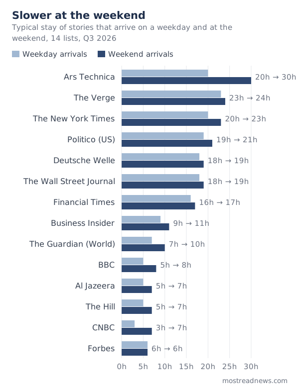
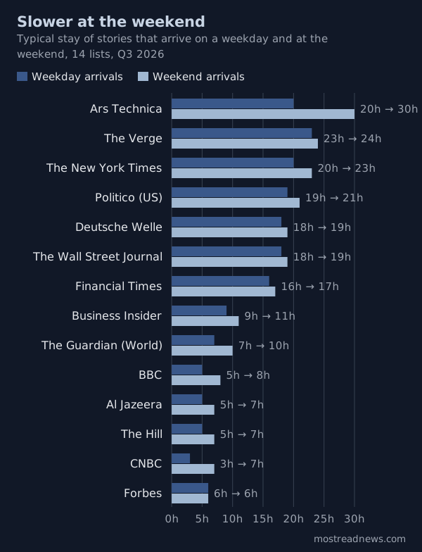
Weekend arrivals stay longer on 13 of the 14 lists; on the fourteenth, Forbes, the two are level. The biggest changes are on CNBC, where the typical stay more than doubles, from 3 hours to 7, on the BBC (5 to 8) and on Ars Technica (20 to 30). Across all 14 lists, a story that arrives at the weekend stays about a quarter longer than one that arrives on a weekday on the same list.[7]
Fewer new stories arrive at the weekend, also on 13 of the 14 lists; Politico, at about six a day either way, is the exception. Together, the 14 lists take in 216 new stories on an average weekday and 164 on an average weekend day: a quarter fewer.
Why fewer new stories mean longer stays. The two facts are linked by simple arithmetic. A list has a fixed number of places, and they're always filled: CNBC's list shows five stories at every reading. Over a day, five places add up to 120 story-hours, five places times 24 hours, and every one of those hours belongs to some story. The stories passing through the list share them. On a typical weekday, about 23 new stories arrive, and 120 hours shared among 23 stories comes to just over five hours each. On a typical weekend day, 11 arrive, and each gets about eleven. The stays I recorded agree: CNBC's weekday arrivals lasted 5.3 hours on average, its weekend arrivals 10.1.
The medians, 3 hours and 7, are lower than these averages because a few stories hold on for a day or more, but the proportion holds: halve the newcomers, and each one's share roughly doubles.
It's the same arithmetic as Business Insider's change in the previous section, working in the other direction. There, 40% more stories competing for the same ten places meant shorter stays. Here, fewer stories competing for the same places mean longer ones.
Why fewer new stories reach the lists at weekends, because less is published or because readers settle on fewer stories, I can't separate from the lists alone.
CNBC shows the pattern most clearly, because its list follows the stock market's week. During a weekday's trading hours, 9 a.m. to 4 p.m. New York time, about nine new stories reach its list, and a typical one stays 2 hours. Over the two days from 6 p.m. on Friday to 6 p.m. on Sunday, about 19 arrive, twice as many in seven times as long, and a typical one stays 7 hours. New stories pick up again on Sunday evening, when futures trading and Asian markets open for the week, and the typical stay shortens to 5 hours.
It isn't the weekend's news mix. Weekend news differs from weekday news, with more sport and less business, so perhaps the weekend simply carries longer-lived subjects. That doesn't account for it. Comparing only stories on the same subject, weekend arrivals still stayed longer in 20 of the 22 subjects with enough stories to test, from crime and US politics to the economy and the Middle East. The two exceptions are consumer technology, most of whose stories are on The Verge's list, which has almost no weekend effect to begin with, and US professional sport. The same holds between weekdays: on every one of the 14 lists, busier days brought shorter stays.
One caveat: on Business Insider, Forbes and The Verge, much of the weekend's spare list time goes to older stories rather than to the weekend's arrivals, so those arrivals gain little.
The two lists left out. TechCrunch keeps a typical story for nearly four days, so every stay spans a weekend whichever day it starts. New Scientist's weekend arrivals are mostly older pieces resurfacing for a few hours, a different kind of story from its weekday ones.
For a reader, the practical point is that most lists slow down at weekends. A second look at CNBC's or the BBC's list on a Saturday afternoon is likely to show more of the morning's stories than the same look on a Wednesday would.
Does the subject matter? Less than the list it's on
It's natural to assume that some kinds of stories simply last longer: big international news, say, or celebrity gossip. The difficulty is that a political story on CNBC's list and a political story on The Verge's list live on different clocks. Comparing raw stays would mostly compare lists, not subjects.
So I measure each story against its own list's norm. A story that lasted 6 hours on CNBC's list, where the median is 3, scores 2.0: twice its list's typical stay. A 6-hour story on The Verge's list, where the median is 23, scores about 0.26. A subject that genuinely outlasts others should score above 1 on nearly every list that carries it.[8]
Very few do. Of the nine subjects that most lists carry, two come close, running long on at least three lists in four:
- US politics stories stayed longer than their list's typical story on 8 of the 9 lists with enough of them.
- Medical and health stories did so on 9 of 12.
The other seven split, some evenly, some leaning one way. Middle East stories ran long on five lists and short on four. Business stories ran long on seven and short on five. Climate and energy stories ran long on four and short on six. Pooled across all lists, a subject can still look long or short, but on closer inspection that usually comes from one or two lists carrying most of its stories.
The two most extreme subjects show this clearly:
- Stock-market stories are the shortest-lived subject when all lists are pooled, at a third of their lists' typical stay. But 203 of the 286 are CNBC's, where a markets story typically lasts one hour, against four for everything else on its list. Outside CNBC there are only 83, spread over seven lists, too few to say whether market news is short-lived in general. This is a CNBC finding: on its list, market news is the most perishable subject of all.
- Homes and moving is the longest-lived subject when all lists are pooled, at 1.8 times their lists' typical stay. But 95 of its 132 stories are Business Insider's, and most of its longest-lasting are first-person stories about where and how people live, such as a tiny home built for a mother with Alzheimer's. A typical one lasted 25 hours, against 9 for Business Insider's list as a whole. This is a Business Insider finding.
The honest conclusion is the modest one. Which list a story appears on predicts its stay much better than what the story is about. Subjects do make a difference on individual lists, as CNBC's market stories show, but the direction of that difference changes from list to list, while the gap between the fastest and slowest lists, thirty-fold from CNBC to TechCrunch, is always there.
Longevity records
"Longest-lived" means different things depending on what you count, so I give the records by measure.
Longest on a list. New Scientist's "We're finally learning what happens to gifted children in adulthood" stayed on its list for 400 hours, nearly 17 days. Last quarter's record was 194 hours. New Scientist holds seven of the top eight places in this measure, all between 223 and 400 hours. That says more about New Scientist's list than about science: as the earlier sections show, it gives a sixth of its time to stories more than a week old, and a few of them stay for weeks. The one exception, and the longest stay outside New Scientist, is Business Insider's story of a woman who built her parents a 725-square-foot cottage in her backyard: 261 hours.
Longest at #1. New Scientist's "The shock revelation that light bulbs are wrecking your metabolism" spent 118 hours at the top of its list, just ahead of its piece on high-dose CO2 clearing Alzheimer's proteins (117 hours). Last quarter's record was 79 hours, and it falls even without New Scientist: Forbes's "Scientists Discover The Fourth Transmissible Cancer Known To Science" held #1 for 96 hours.
Most dominant. The clearest case of a story that simply owned its list is Deutsche Welle's "As water runs short on Rhine, ships left high and dry": it was at #1 for 77 of its 78 hours, every hour but one. That Forbes story comes next, at #1 for 96 of its 102 hours.
The Times and TechCrunch are not in the #1 records, because their lists have no popularity order.
Sources that left and joined
Two lists I tracked from the start of the quarter are missing from this report's tables, because I stopped tracking them before it ended: The Dispatch at the end of August and AP News in mid-September. Three lists that joined during the quarter were also retired before it ended: France 24, TMZ and Page Six. A separate report, published later this week, explains each decision.
Many more joined. During Q3 the site grew from 18 tracked lists to 49, organised into 12 news desks, including Hollywood, the UK, Canada, Europe, Asia and Australia. None of the new lists was tracked for the whole quarter, so they're not in this report either. They debut in the Q4 report.
Data completeness
Coverage is the share of the quarter in which I was recording a list at all; directly recorded is the share of this report's readings captured first-hand rather than reconstructed for a short gap. The corpus is every story dated 1 July to 30 September 2026 (UTC), 19,216 stories in all.
| Source | Coverage | Directly recorded |
|---|---|---|
| Al Jazeera | 99.09% | 100.00% |
| BBC | 99.09% | 100.00% |
| Business Insider | 99.09% | 100.00% |
| Forbes | 99.09% | 99.98% |
| The Verge | 99.09% | 99.95% |
| Deutsche Welle | 99.09% | 99.95% |
| Financial Times | 99.09% | 98.79% |
| CNBC | 99.09% | 98.77% |
| The New York Times | 99.09% | 89.95% |
| TechCrunch | 99.05% | 97.45% |
| The Wall Street Journal | 98.87% | 95.90% |
| Ars Technica | 98.69% | 96.63% |
| The Hill | 98.55% | 94.45% |
| Politico (US) | 98.41% | 95.16% |
| New Scientist | 96.47% | 100.00% |
| The Guardian (World) | 91.03% | 73.83% |
| All sources | — | 95.52% |
This is a much stronger record than Q2's. Fourteen of the sixteen lists were recorded for more than 98% of the quarter, and the common ceiling of 99.09% reflects two recording gaps that affected every list equally, of 15 hours in July and 5 in August. New Scientist has its own gap of about three days in July.
Two rows need explaining. The Guardian (World) was read in every hour the site was recording, the same 99.09% as the lists at the top of the table. Its lower figures are about which list those readings landed on, not about readings missed. The Guardian keeps a separate Most viewed list for each of its editions and sections; the one in this report, and on this site, is its World news list. Until mid-September, about two readings in five landed on another edition's list instead. Those readings are now removed, and the Q2 report carries a correction. The hours they covered count as unrecorded for the World list, and short stretches of them are reconstructed, which is why its median rises from 8 to 11 hours when reconstructed readings are counted. The New York Times is lower on directness because for part of the quarter I recorded only half of its twenty-story list; the missing half was filled in from the stories' presence before and after, and is marked as reconstructed. That's why its median rises from 21 to 24 hours on the reconstructed count.
For every other list, the direct and reconstructed medians in the main table are identical or an hour apart, and the conclusions don't depend on which count you use.
What changed in the method
My methodology page was updated to version 1.1 on 28 September, with a dated list of every change. Three matter for reading this report:
- Which stories count. Q2 counted stories by publication date. From Q3, a story counts by its publication date when I have one, and otherwise by the time it first appeared on a list. For almost every list the two rules pick the same stories; the second simply keeps stories whose publication date I never captured.
- Stays that ran past the end of the quarter. As in Q2, a story that belongs to the quarter keeps counting after 30 September. When the quarter ended, its stories held all 131 places on the sixteen lists; by the time I took these figures, they held 15. Their remaining hours can't move any list's median except TechCrunch's, and that one by three hours at most.
- Three lists corrected. The Guardian's World list (see Data completeness), and The New York Times and TechCrunch, which are now treated as lists without a popularity order.
Notes
Corrections: errors are fixed in place with a dated note at the foot of this page. Spotted something wrong? Get in touch.
Median stay — the middle story's cumulative hours anywhere on its site's list, counting only readings I recorded directly. Half of all stories lasted that long or less, half that long or more. The Q2 reports called it Median Duration. ↩︎
Median, +reconstructed — the same median with short interpolated gaps counted as time on the list. For most lists it adds nothing or an hour; it adds three hours for The Guardian (World) and The New York Times, for reasons given in Data completeness. At the 90th percentile it adds at most three hours for any list except The Guardian (World), whose 90th percentile rises from 20 to 25 hours. ↩︎
90th percentile — the stay only the longest-lasting tenth of stories exceed, on the direct count. ↩︎
Time to list — the time from a story's publication to its first appearance on its site's list, as a median across the list's stories, rounded to the nearest half hour. Measured on stories published 1 July to 4 September 2026. The Guardian (World) figure comes from the period before its record was corrected, so read it as approximate. ↩︎
The Q2 figures differ from the Q2 report's original table only where that report's dated notes say they do: The Guardian is its World news list alone, and Al Jazeera's rolling live blog is no longer counted. ↩︎
Weekday and weekend arrivals — each story counts by the day it first appeared on its list, in the publisher's time zone: New York for the American lists, London for the BBC, The Guardian and the Financial Times, Berlin for Deutsche Welle and Doha for Al Jazeera. Al Jazeera's list shares the Saturday–Sunday weekend. The comparison covers stories that first appeared between 1 July and 30 September 2026. New stories a day are averaged over the quarter's 66 weekdays and 26 weekend days, and count every story on its first appearance, older pieces included. ↩︎
About a quarter longer — each story's stay is divided by the geometric average stay of its own list's weekday arrivals; the figure is the geometric average of that ratio over all weekend arrivals on the 14 lists, 1.24. A geometric average suits stays, because a handful of very long stays can't dominate it. Stories with no directly recorded hours are left out, since a geometric average can't include a zero. ↩︎
Relative stay — a story's hours on its list divided by that list's median stay. A subject's figure is the median of its stories' relative stays. Subjects come from my categorisation of each story; the Financial Times is left out because its stories carry no categories. A list is counted for a subject only if it carried at least 15 of that subject's stories. ↩︎